TLDR:
- Users spend 80% of their total time on a webpage above the fold, according to Nielsen Norman Group eye-tracking research. Everything below it is working with the attention that survives the first screen.
- CTAs placed above the fold produce 304% more clicks than those placed below it. Most service business homepages either bury the CTA or replace it with a vague slogan where the offer should be.
- 70% of mobile users never scroll below the fold at all. On 70% of mobile landing pages, visual content above the fold takes over five seconds to load. Both numbers are happening to the same visitor at the same time.
- Websites with a clear value proposition above the fold convert at 2.3 times the rate of those that do not. Clarity is not a design preference. It is a revenue variable.
The phrase “above the fold” came from newspaper publishing. The most important story goes in the upper half of the front page because that is what a reader sees when the paper is folded on the newsstand. Everything above the fold has to earn the decision to pick it up. Everything below the fold is only seen by readers who already decided it was worth their time.
The web version works the same way. The section of a page that is visible without scrolling carries a disproportionate share of the work. It earns the scroll or it does not. Most businesses understand this in theory and then completely ignore it in practice, handing the most valuable real estate on their website to a vague brand statement and an oversized photograph of something that has nothing to do with what the visitor came to find.
The misunderstanding is not about the concept. It is about what the space is actually for.
What Above the Fold Web Design Is Actually Supposed to Do
Above the fold is not decoration. It is a sales conversation compressed into the first screenful of content a visitor sees. That conversation has three specific jobs: answer what the business does, confirm who it is for, and give the visitor a clear next step. Every element in that space should be accountable to one of those three jobs or it should not be there.
Users spend 80% of their total page time in this zone. Nielsen Norman Group eye-tracking research shows that attention drops significantly below the fold, and that the majority of visitors make their decision to stay or leave before they ever reach the second screen. The hero section is not an introduction to the rest of the page. It is the entire pitch delivered in the time it takes someone to decide whether to scroll.
Visitors form a first impression of a website in approximately 50 milliseconds. That judgment is primarily visual, but the clarity of the communication follows immediately after. A visitor who cannot identify what the business does and whether it applies to them in the first five seconds is statistically unlikely to scroll further. They leave. The above the fold section is where that decision is made, and most businesses are fielding it with content that was written to impress internal stakeholders rather than to answer a stranger’s first question.
The Hero Section Problem That Most Web Projects Never Solve
The hero section is the centerpiece of the above the fold zone. It typically contains a headline, a subheadline, a primary image, and a CTA. In a well-built homepage, each of those elements is doing specific work. In most service business homepages, at least two of them are not.
The most common failure point is the headline. A service business headline above the fold should describe what the company does and who it does it for, in plain language oriented toward the buyer’s outcome. What most businesses have is a brand statement. “Built for the bold.” “Driven by results.” “Where ambition meets execution.” These phrases communicate aesthetic sensibility and nothing else. A first-time visitor cannot tell what the company sells, who its clients are, or why they should stay.
The supporting subheadline is where clarity usually has to compensate for a vague headline, but most subheadlines double down on the vagueness instead. “Helping businesses achieve their goals” is not a subheadline. It is a placeholder. The combination of a vague headline and a vague subheadline means the visitor reaches the CTA without having been given a single reason to click it. Websites with clear value propositions above the fold convert at 2.3 times the rate of those without one. That multiplier does not require a redesign. It requires rewriting the first two sentences on the page.
The Mobile Problem That Makes Above the Fold Design Twice as Important
Above the fold is not a single fixed location. It varies by device, screen size, browser settings, and resolution. On a desktop monitor, the fold might sit around 600 pixels from the top. On a smartphone in portrait mode, the fold is much lower. The content that appears above the fold on a 27-inch monitor may be partially or entirely below it on a phone.
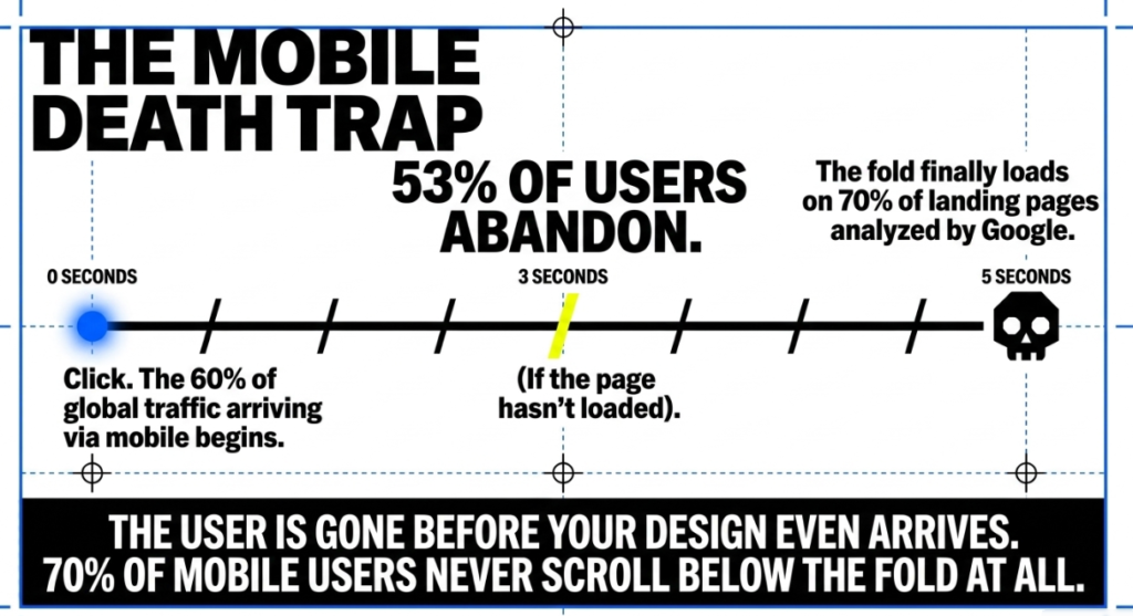
This matters because 60% of global web traffic now comes from mobile devices. 70% of mobile users never scroll below the fold at all. Whatever is visible on the first screen on a phone is all most mobile visitors will ever see. For a business spending money on Google Ads or relying on organic search, the majority of that traffic is arriving on mobile, encountering a first screen that was designed on a desktop, and making a decision within five seconds.
The speed dimension compounds this further. On 70% of mobile landing pages analyzed by Google, visual content above the fold took more than five seconds to load. 53% of mobile visitors abandon a page that takes longer than three seconds. The combination means that a significant portion of mobile visitors never see the hero section at all, not because the content failed them but because the page did not load fast enough to give them the chance. Above the fold optimization without load speed optimization is solving half the problem.
What Designers Get Wrong About This Space
The tension between above the fold design and visual design is real and worth naming directly. Designers are trained to create visual systems that feel cohesive, elevated, and intentional. The above the fold requirements often work against those instincts. A benefit-driven headline in plain language can feel unpolished. A high-contrast CTA button can feel aggressive relative to a carefully controlled color palette. Social proof elements placed in the hero section can feel like clutter.
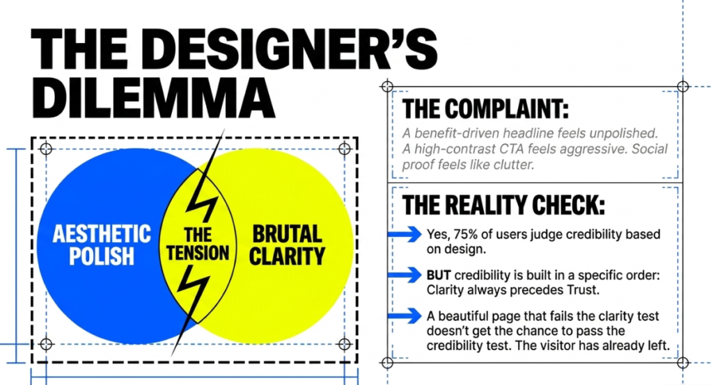
These are legitimate aesthetic concerns. They are also the exact trade-offs that most agency design reviews never surface, because the design review is attended by people evaluating how the page looks rather than people measuring what it produces. The result is pages that win awards and lose leads.
75% of users judge a business’s credibility based on web design. That statistic is often used to argue for investing in visual quality, and visual quality does matter. What it does not address is that credibility is built in a specific order. The visitor first needs to understand what the business does. Then they assess whether it looks trustworthy. A beautiful page that fails the clarity test does not get the opportunity to pass the credibility test, because the visitor has already left.
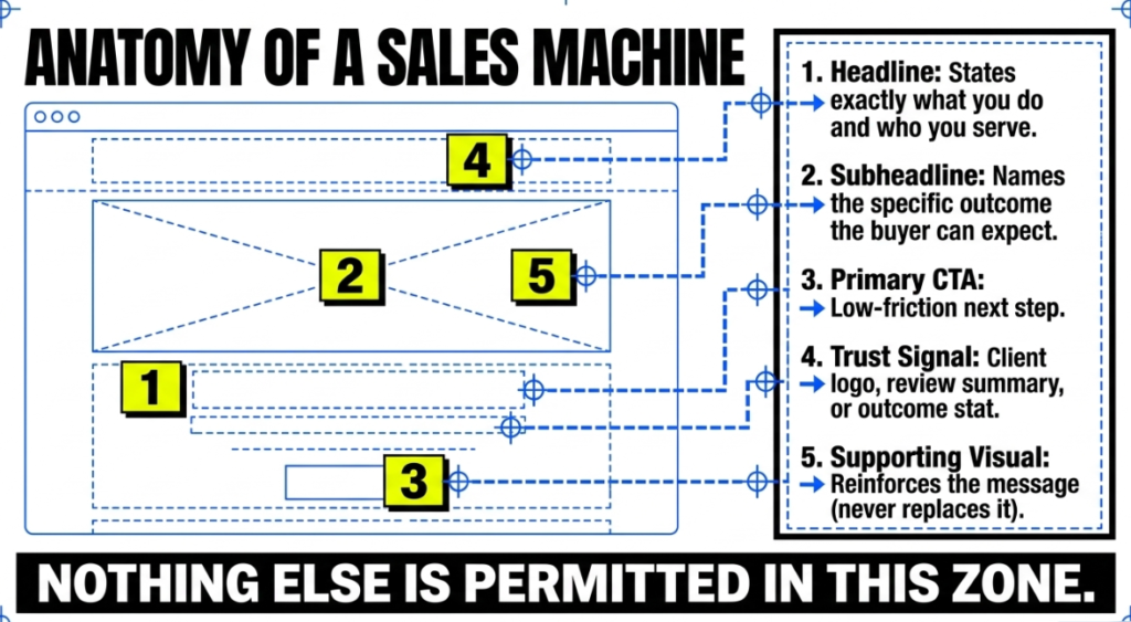
What Actually Belongs in the Above the Fold Section
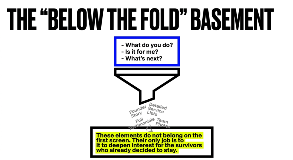
The above the fold section of a service business homepage needs five things, and almost nothing else. A headline that states what the business does and who it serves. A subheadline that names the outcome the buyer can expect. A primary CTA that describes a specific, low-friction next step. A trust signal, either a client logo, a review summary, or a specific outcome stat. And a supporting visual that reinforces the message rather than replacing it.
Everything else is a candidate for below the fold. The founder story, the detailed service list, the full testimonial section, the team photos. These elements have a role in the conversion process, but that role is to deepen interest for visitors who already decided above the fold to stay. Trying to put all of it in the first screen results in a cluttered hero section that answers nothing quickly because it is trying to answer everything at once.
CTAs placed above the fold generate 304% more clicks than those placed below it. Centered CTAs receive 682% more clicks than left- or right-aligned ones. These numbers are not arguments for ignoring design. They are arguments for designing the above the fold section around the conversion goal first and the visual system second. Big Click Energy builds hero sections as sales infrastructure. The aesthetic follows the structure, not the other way around. For businesses that have a beautiful page that generates almost no inquiries, the gap between those two sentences is usually the explanation.
FAQ
What does above the fold mean in web design?
Above the fold refers to the portion of a webpage that is visible without scrolling. The term originates from newspaper publishing, where the most important content appeared in the upper half of a folded front page. In web design, it describes the first screenful of content a visitor sees when they land on a page. Its dimensions vary by device and screen size, which makes mobile optimization particularly important since the fold sits much lower on a phone than on a desktop monitor.
Why does above the fold content matter for conversion rates?
Because most visitors make their decision to stay or leave before they scroll. Users spend 80% of their total page time above the fold. 70% of mobile users never scroll at all. A visitor who does not understand what the business does or who it serves within the first five seconds is statistically unlikely to take a next step. Websites with a clear value proposition above the fold convert at 2.3 times the rate of those without one, and CTAs placed above the fold generate 304% more clicks than those placed below it.
What should be included above the fold on a service business homepage?
A clear headline that describes what the business does and who it serves. A subheadline that names the buyer’s outcome. A primary CTA that describes a specific next step. A trust signal such as a client logo, testimonial summary, or a documented result. And a supporting visual that reinforces the message. Everything else belongs further down the page. The above the fold section should answer three questions immediately: what does this business do, is it for me, and what should I do next? If any of those three require scrolling to answer, the section needs revision.
Does above the fold still matter if most users scroll now?
Yes. Scrolling behavior has increased, but the above the fold section still determines whether the visitor decides to scroll at all. Users who understand what a page offers within the first screen are far more likely to continue. Those who cannot answer the three basic questions within five seconds leave before reaching anything below the fold. The space remains the most consequential section of any homepage because it makes the decision that allows everything else to be seen.
How does mobile affect above the fold design?
On mobile, the fold sits much lower than on desktop, meaning less content is visible on the first screen. 70% of mobile users never scroll below the fold. 53% of mobile visitors abandon a page that takes more than three seconds to load. On 70% of mobile landing pages, visual content above the fold takes over five seconds to load. Together these numbers describe a significant portion of mobile visitors leaving before seeing the hero section at all. Optimizing above the fold for mobile requires both compressing the layout to work on smaller screens and prioritizing load speed of the initial visible content.