TLDR:
- Opinions about a site form in about 50 milliseconds, before any copy is read.
- One above-the-fold restructure lifted conversions from 3.2% to 5.8% and cut bounce rate from 48% to 32%.
- 92% of consumers hesitate when reviews or proof are missing from the page.
- Most homepages fail not from lack of design, but from lack of a visible offer.
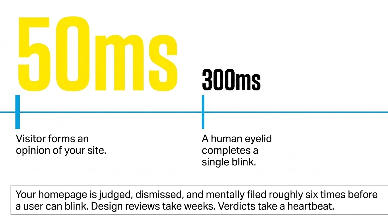
Fifty milliseconds. That is how long a visitor takes to decide whether a website is worth their attention. For context, a human blink takes three hundred. Which means the homepage is judged, dismissed, and mentally filed roughly six times before the eyelid completes a single close.
This is the uncomfortable math at the center of web design as it’s currently practiced. Design reviews take weeks. Verdicts take less than a heartbeat.
What Above-the-Fold Web Design Is Actually Doing
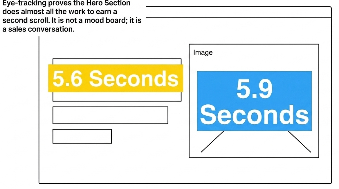
Eye-tracking data shows visitors spend close to 5.9 seconds on the main image and 5.6 seconds on the written content nearest it. The hero section is doing almost all of the work a homepage will ever do to earn a second scroll. Not the portfolio section. Not the founder bio. The top of the page. The part where most businesses put a vague headline and a very expensive photograph of no one in particular.
A restructured hero section, one built around a clear headline, a supporting visual, and a visible CTA, moved conversion rate from 3.2% to 5.8%, cut bounce rate from 48% to 32%, and nearly doubled time on page. None of those changes involved a rebrand. They required someone to stop treating the top of the page like a mood board and start treating it like a sales conversation.
Interestingly, that distinction does not seem to come up much in discovery calls.
Homepage User Experience and the Scroll That Never Happens
Homepage user experience is measured one way internally and a completely different way by the people it is supposed to serve. Inside the building, “clean” and “elevated” are high praise. Outside the building, the test is simpler: can a stranger answer three questions before their thumb decides to move on? What does this company do, who is it for, and what happens if I click that button.
Those are not difficult questions. And yet a truly remarkable number of homepages do not answer them above the fold.
The most common revision request agencies receive, according to people who have sat through enough of these calls to lose count, is “make it pop.” The second most common is “can we add some movement.” Neither of these requests has ever appeared in a conversion rate optimization study as a documented driver of inquiry volume. What does appear, consistently, is offer clarity, visible proof, and a path to action that does not require the visitor to go looking for it.
Sources might interpret the gap between what clients request and what converts as a failure of expectations. Or as a very expensive miscommunication that has been happening for about two decades.
The Social Proof Missing From Most Homepage User Experience
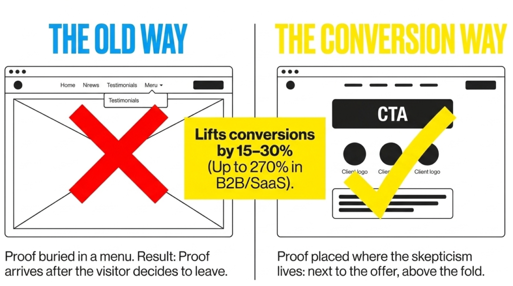
Consumer data compiled across thousands of purchasing decisions shows that 92% of buyers hesitate when reviews are absent, 72% trust customer reviews over brand-written product descriptions, and 40% will not complete a purchase at all if no social proof appears on the page. Visible proof typically lifts conversions by 15 to 30%. In B2B and SaaS contexts, optimized implementations have been documented at 270%.
Knowing all of that, a reasonable person might wonder why so many premium-priced service homepages still route testimonials to a separate page, accessible only through a navigation menu most first-time visitors never open. The logic appears to be that a dedicated page feels organized. The consequence is that the proof arrives after the visitor has already decided to leave.
Conversion-focused web design places the proof where the skepticism lives, which is at the top of the page, next to the offer, before the scroll. Client logos. A number with context behind it. A quote from a named human being who had a real problem and watched it get solved. These elements are small. They do not require a new design system. They are also, with a consistency that borders on tradition, the first things removed when a designer describes the page as “too busy.”
The Website Conversion Strategy Pattern That Keeps Repeating

There is a version of a homepage that works. The promise is stated in plain language. The visual exists in service of that promise. The proof is visible before the visitor scrolls. The next step is clearly labeled in words a real person would say out loud, not “explore,” not “learn more,” not “begin your journey.”0
There is also a version that does not work, and it follows its own recognizable pattern. A headline written during a branding session attended by twelve people with different opinions. A looping background video selected because it tested well with internal stakeholders. A CTA that says “Learn More,” which is not an invitation so much as a placeholder.
The agencies responsible for these pages tend to call them “sophisticated.” The website conversion strategy data tends to describe them as politely losing business on a daily basis.
Aesthetic Investment and Conversion Rate Optimization
None of this is a case against thoughtful design. A well-executed site communicates competence, and competence communicates safety to buyers who are considering spending real money. That part matters.
The argument is narrower. When the visual system is asked to carry the homepage alone, without a clear offer underneath it, what remains is expensive decoration. And decoration, however beautiful, does not answer the three questions. It does not earn the scroll. It does not move the 50-millisecond verdict in the right direction.
Big Click Energy approaches homepages as sales infrastructure, not digital art installations. The difference, for most businesses that have tried it both ways, shows up in the metrics within the first quarter. Not a complicated philosophy. Just a less common one than it should be.
FAQ
What is conversion-focused web design? It is web design built around a specific outcome rather than a visual standard. Every element, the headline, the imagery, the call to action, exists to move a visitor toward one defined next step. It is less concerned with how the page looks in a design review and more concerned with what happens to the visitor’s behavior after they land.
How do I know if my website is actually converting? The clearest signal is the gap between traffic and inquiries. If sessions are steady but contact form submissions, calls, or purchases are not, the page is functioning as a brochure rather than a sales tool. Conversion rate optimization audits typically start here, and the culprit is usually the hero section.
What should be above the fold on a homepage? A clear statement of what the business does, who it serves, and what the visitor should do next. Eye-tracking research shows visitors spend the most time on the main image and the written content immediately surrounding it, which means the offer needs to be visible before any scrolling occurs. A CTA buried below the fold is functionally invisible to a significant portion of visitors.
Does web design affect SEO? Yes, though the relationship is more structural than visual. Page speed, mobile responsiveness, and clear content hierarchy all factor into how search engines evaluate a site. A page that loads slowly, shifts layout on mobile, or buries its primary content in design elements tends to underperform in both rankings and homepage user experience metrics like time on page and bounce rate.
How long does it take to see results from a redesign? Documented case studies place meaningful conversion improvements within weeks of restructuring the above-the-fold section alone. Full website conversion strategy changes, including copy, proof placement, and CTA structure, typically reflect in analytics within one to three months. Results tied to organic search take longer, as search engines index and re-evaluate updated pages on their own schedule.