
TLDR:
- A one-second delay in page load time reduces conversions by 7%. Most service business homepages take over four seconds to load on mobile.
- CTAs placed above the fold outperform those placed below by up to 304%. Most homepages bury the action.
- Adding social proof below a primary CTA increases conversions by 68%. Most homepages either hide it or remove it entirely.
- 68% of small businesses have never run a single homepage conversion rate optimization test. They redesign instead.
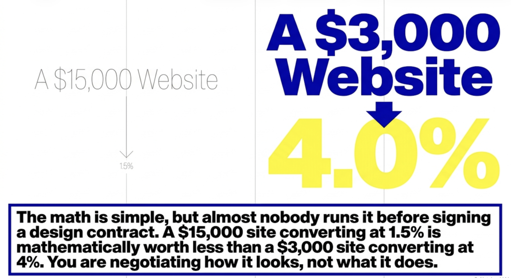
A $15,000 website that converts at 1.5% is worth less than a $3,000 website that converts at 4%. That math is simple, and almost nobody runs it before signing a web design contract. The conversation is almost always about how the site looks. Rarely about what it is supposed to do.
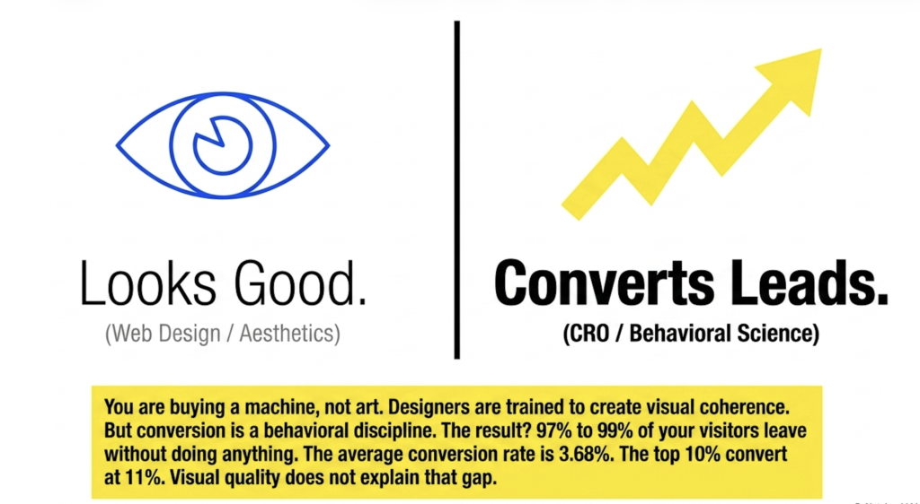
This happens because web design has a very old problem. Designers are trained to make things look good. The best ones are genuinely talented and they care deeply about the craft. The problem is that “looks good” and “converts visitors into leads” are separate skills, and most agencies are better at the first one. Conversion rate optimization is not a design discipline. It is a behavioral one.
The result is a predictable pattern. A business builds a beautiful website, traffic comes in, and nothing much happens. The agency gets paid, the site gets published, and somewhere between 97% and 99% of visitors leave without doing anything at all.
What Homepage Conversion Rate Optimization Actually Measures
Conversion rate optimization is the practice of systematically improving what percentage of visitors take a desired action. For a service business homepage, that action is usually a form submission, a phone call, or a move into the sales pipeline. The average website conversion rate across industries is around 3.68%. The top 10% of landing pages convert above 11%.
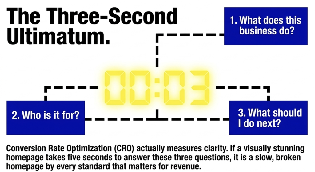
The gap between those two numbers is almost never explained by visual quality. It is explained by offer clarity, proof placement, and the speed with which a visitor can answer three questions: what does this business do, who is it for, and what should I do next. A visually stunning homepage that takes five seconds to answer those three questions is a slow homepage by every standard that matters for revenue.
68% of small businesses have never run a homepage conversion rate optimization test. They redesign. A new look, a new color scheme, a new developer, a new year. Conversion rate stays roughly the same because the redesign addressed the aesthetics and left the structure untouched.
The Above-the-Fold Section and Why It Is Doing All the Work
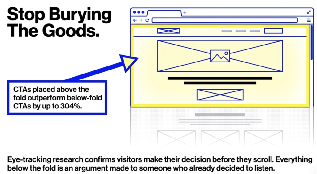
Eye-tracking research confirms what common sense already suggests: visitors make most of their decision about a page before they scroll. The hero section, the headline, the main image, the CTA, those elements earn or lose the visitor’s commitment to stay. Everything below the fold is an argument made to someone who already decided to listen.
CTAs placed above the fold outperform those placed below by up to 304% in aggregate data. That is not a reason to put a generic CTA at the top of a page. It is a reason to ensure your offer is clear enough that a CTA above the fold actually earns a click. A visitor who lands on a vague headline and a button that says “Get Started” has not been given a reason to go anywhere. They just bounce.
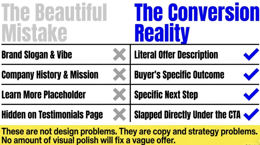
The hero section needs to answer the three questions before the scroll: what the business does, who it serves, and what happens next. In practice, most service business homepages fail at least two of these. The headline is a brand slogan rather than an offer description. The subheadline explains the company’s history rather than the buyer’s outcome. The CTA says “Learn More,” which is not a next step, it is a placeholder. These are not design problems. They are copy and strategy problems, and no amount of visual polish will fix them.
Social Proof Placement on a Homepage and the Revenue That Moves with It
Adding social proof below a primary CTA increases conversions by 68%. Placing testimonials adjacent to CTAs drives an additional 25% lift. Most service business homepages put testimonials in a separate section near the bottom of the page, or link to a dedicated testimonials page that very few first-time visitors ever open. The logic is that it feels organized. The consequence is that proof arrives after the visitor has already decided.
The businesses that convert best have logos, numbers, and real client quotes visible in the hero section or directly beneath it. Not as decoration. As responses to the objection that every first-time visitor carries: why should I trust this? A named client quote with a specific outcome answers that question. A five-star average from 200 reviews answers it. A client logo from a recognizable company answers it. A testimonials page buried in the navigation does not.
Placing enterprise or recognizable client logos above the fold has driven 260% more conversions in documented B2B contexts. The mechanism is straightforward. If a company the visitor has heard of trusts this business, the credibility transfers. It is not about impressing anyone. It is about reducing the uncertainty that makes people close a tab instead of filling out a form. Proof should live where the skepticism lives, not in a section the visitor never reaches.
Page Speed and What It Is Actually Costing a Homepage
Every one-second delay in page load time reduces conversions by 7%. A site that loads in one second converts at rates roughly three times higher than a site that loads in five seconds. 53% of mobile visitors abandon a page that takes longer than three seconds. These are not soft preference metrics. They are direct revenue numbers.
The average mobile page still takes over six seconds to load. Most service business websites, especially those built on popular drag-and-drop builders with multiple plugins and oversized image files, land well outside the range where conversion rates hold. The business is spending money on ads and SEO to drive traffic to a page that loses more than half its mobile visitors before the headline even renders.
This is why conversion rate optimization cannot begin with a new design. It has to begin with a technical and structural audit. Speed, mobile responsiveness, and content hierarchy all need to be working before any copy or CTA testing produces reliable results. A beautiful site that loads in five seconds and has a vague headline is competing against a plainer site that loads in one second and says exactly what it does. The plainer site wins on leads. It almost always does.
Why Most Designers Push Back on Conversion-Focused Web Design
Most web designers are not anti-revenue. They are trained in a discipline that prizes visual quality, craft, and aesthetic coherence. A conversion-focused homepage frequently asks them to make choices that feel wrong from a design perspective: a headline in plain, direct language instead of a brand statement; social proof elements that break the visual flow; a prominent, high-contrast CTA that looks out of place against a carefully considered color palette.
These are real tensions and the designer is not wrong to feel them. The problem is that the client is not buying art. They are buying leads, and the two optimization targets diverge at specific moments. Proof at the top feels cluttered. A specific headline feels unpolished. A visible CTA feels aggressive. What the data actually shows is that these elements, built correctly into the structure of the page, are what converts.
Big Click Energy designs homepages as sales infrastructure. The visual system is built to serve the conversion structure, not the other way around. For businesses that have already paid for a site that looks exceptional but generates nothing, that sequence change tends to be the intervention that finally moves the numbers.
FAQ
What actually makes a homepage high-converting? A high-converting homepage answers three questions immediately: what the business does, who it is for, and what the visitor should do next. It places social proof where skepticism lives, at the top and adjacent to the primary call to action. It loads fast, particularly on mobile. And it uses a CTA that describes a real next step in plain language rather than a vague prompt. None of those elements require an expensive visual overhaul. They require a structural strategy built around buyer behavior rather than aesthetics.
What is a good homepage conversion rate for a service business? For organic search traffic, a conversion rate between 2% and 5% is a reasonable benchmark. The top performers in professional services and B2B categories can reach 7% or higher with systematic homepage conversion rate optimization. If your homepage is below 1.5% on consistent traffic, something structural is broken, usually the headline clarity, the CTA placement, or the absence of visible proof. More traffic will not fix those problems.
How much does page load speed actually affect conversions? Every additional second of load time reduces conversions by approximately 7%. A site that loads in five seconds converts at roughly one-third the rate of a site that loads in one second. 53% of mobile visitors leave before a slow page finishes loading. For a service business generating $500K to $2M in revenue, even a modest improvement in load speed on mobile produces a measurable lift in inquiry volume. This is usually the highest-leverage technical change available before touching any copy or design.
What is the right CTA for a service business homepage? The right CTA describes a specific, low-friction next step that matches where the visitor is in their decision process. For a service business, something like “See How It Works,” “Request a Free Assessment,” or “Talk to Our Team” outperforms generic options like “Get Started” or “Learn More” by a significant margin. PartnerStack documented a 111% conversion increase by changing “Book a Demo” to “Get Started.” The specificity of the action matters. Visitors need to know what they are agreeing to before they click.
Why does my website look great but not generate leads? Because visual quality and conversion performance are separate variables. A homepage can score well on design reviews and poorly on lead generation at the same time. The most common culprits are a headline that describes the business rather than the buyer’s outcome, social proof that is buried below the fold or hidden on a separate page, a CTA that does not communicate a clear next step, and a load time that loses mobile visitors before they read anything. Homepage conversion rate optimization addresses those structural problems. A redesign without that discipline usually produces a new-looking version of the same underperforming page.